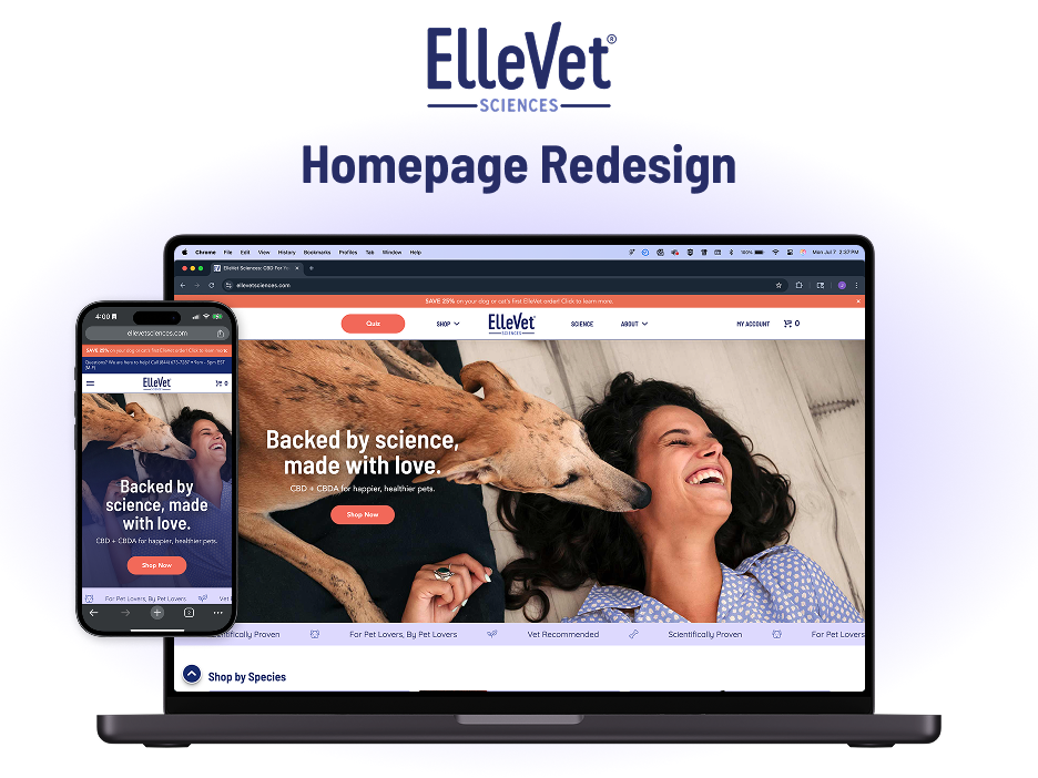
OVERVIEW
Summary
The navigation of our website has been something I've had my eye on updating since I began in this UI/UX Designer role a little over a year ago. I knew that this would not be an easy thing to implement right away, so I have taken meticulous steps to ensure when we were ready to tackle this we would do it right the first time. Over my time here at ElleVet Sciences I have been trying to diversify my UX experiences in a multitude of disciplines. I often find myself doing more than just what is traditionally under UX/UI and more along the lines of product management, with the product being the e-commerce website as a whole. For this navigation project I dipped my toes into Information Architecture for the first time as a professional UX Designer. I familiarized myself with the website's backend menu creation and categorization for blog posts and products, mapped out prospective new IAs, mocked up refreshing new UI designs, and conducted research to support the ideas my team and I came up with throughout this iterative process.
While there is always more to learn and improve on, for now we have landed on a great navigation that looks modern, feels easy-to-use, and improves the overall experience for any customer.
Skills Used
UX Research
Information Architecture
UI Design
Cross-team Collaboration
Tools Used
Figma
UXTweak (research software)
WooCommerce
What am I working with?

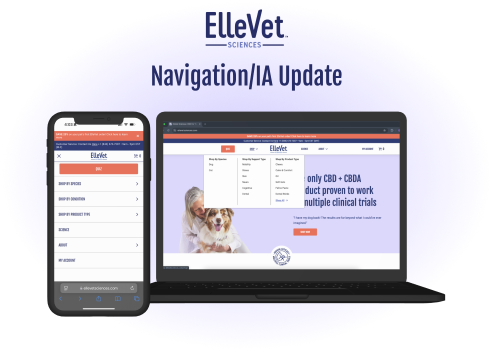
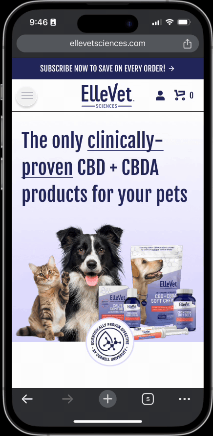
Up to this point, ElleVet has maintained a fairly small product catalog, so the menu navigation has shown all of the products available. While this is an okay experience on desktop, even with the small catalog, the hamburger menu is large and unwieldy on the mobile experience. Mobile users make up over 70% of our users, so this is a highly needed UX improvement area. Furthermore, as the product line diversifies and expands, this navigation UI has reached its capacity and will no longer be a sustainable option. There is a crucial need to start implementing product categorization. While the shopping flow is the most important, the other areas of a website's navigation are all pieces of the puzzle that get people to want to enter this shopping flow. Part of ElleVet's DNA is science first, so we pride ourselves on the information we provide to customers that might not know much about the world of CBD and CBDA products and how accepted it is in the veterinary community. I had to keep this in mind when thinking about how to restructure the Information Architecture for the other aspects of the website.
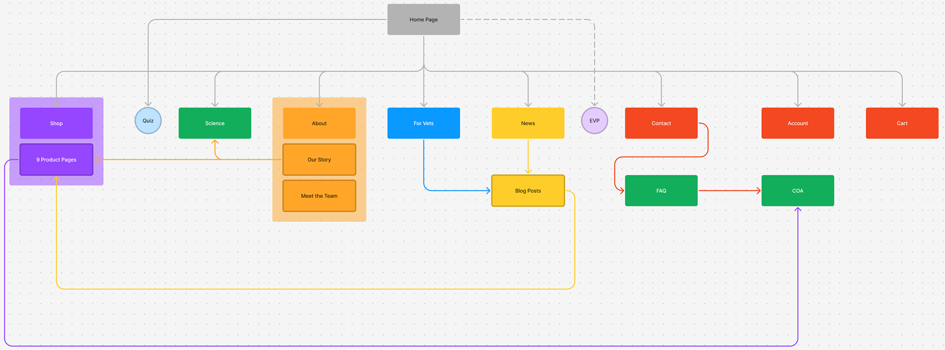
I set out to map the current navigation/IA structure on the site. As I created the flow diagram above, it practically made me shutter. So many different places to navigate to with roughly the same information, linkages between pages were all over the place, and even external links right in the main navigation of the site. I knew my process engineering background would start to come in handy here! I asked myself "how can we make this navigation more efficient?"
IA Restructuring
Information Architecture is definitely the less flashy, "boring" arm of UX design, but bad IA makes for terrible UX, and good IA leaves room for the more flashy aspects of design to shine through because it lightens the mental load of navigation for the user. Oddly enough, I found that restructuring and organizing the IA very satisfying and not boring at all! That being said, there's not a great way to display an IA restructure in a portfolio, and I'd like to avoid being overly verbose about the topic, so I'll give a quick bullet list of what changes I planned to make and show you how those got implemented later on. I used a combination of building a mental model and visualizing this in FigJam, competitive analysis, and collaborative brainstorming with the Marketing and EComm teams.
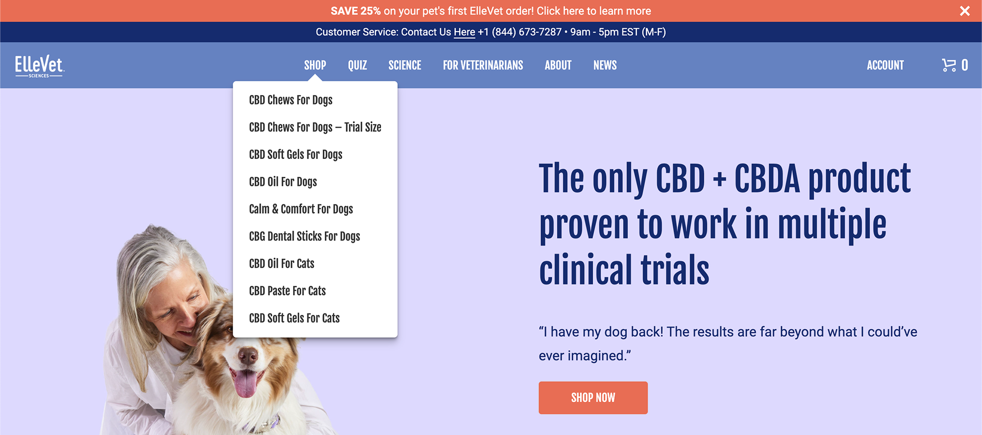
Product Categorization
- Species
- Condition
- Product type
There was some initial hesitation with spreading the products out too much because in some cases it would add an extra step to the shopping flow, but in order to prepare for the growing product catalog, this expansion of categorization is 100% necessary even if it costs an extra step to get to the final product.
Informational Page Organization
- Keep 'Science' as it's own nav item
- Nest all other informational pages into one 'About' dropdown
- Meet the Team
- For Veterinarians
- Our Story
- Blog
- News
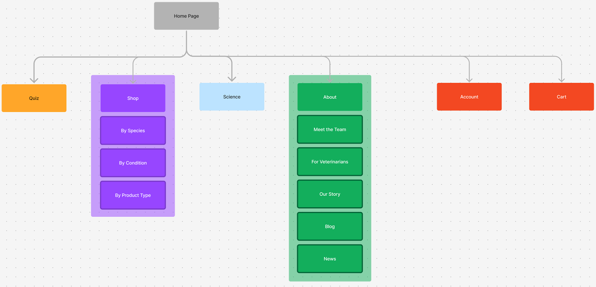
Newly proposed navigation/IA structure
Laying the Groundwork
Before we could really have the development team start to work on implementing this, there was some foundational work that needed to be done first. Since the new product navigation would be categorized into different sub-categories I needed to look into the Woocommerce backend of how our products were currently being categorized and tagged. The organization was, to say the least, a bit all over the place and was obviously set up from the very start of the website with no real growth mindset involved. Tags were barely being used, categories were often just product names. This turned into an equally large side project that I won't go into full detail on here. I set up and documented a new system for product categorization and tagging so that new products could seamlessly fall into the IA without any hassle in the future.
Having this new categorization system meant that there would be built-in landing pages that meshed seamlessly with the new navigation. The old categorization would not have allowed for this, so this was a very welcome benefit!
Design Refresh
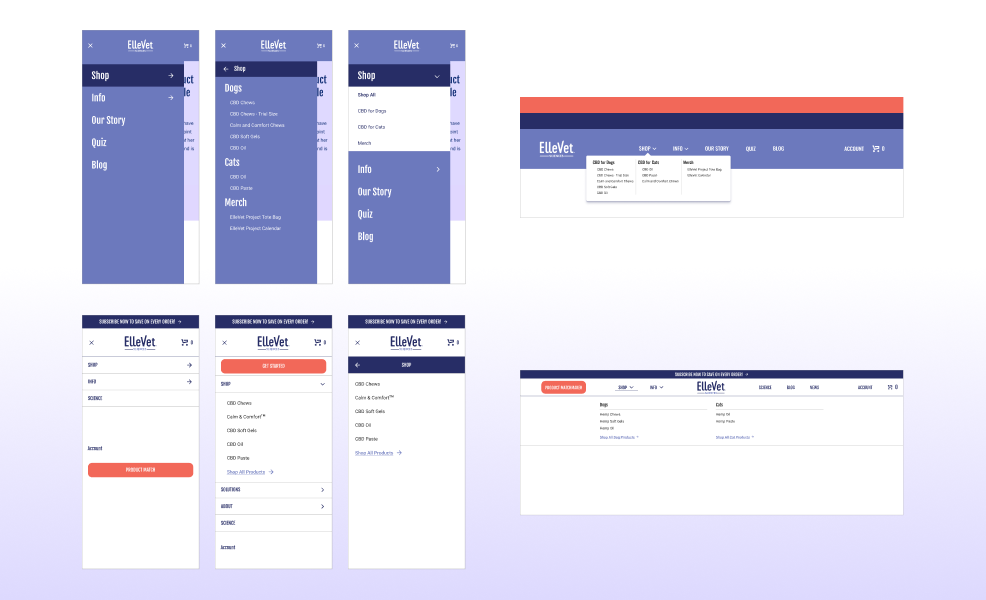
Early wireframe iterations
I started playing around with all different menu designs. Above is just a sampling of the many iterations I went through to land on a final design. I never really liked the big block of periwinkle as the primary background for the navigation. It felt outdated and although it was ADA compliant, had a contrast that was tough to see at times. That's when I started thinking about a white navigation. This increased contrast greatly, as well as gave it a fresh more modern look. I started teasing the idea of this around to other teams and started getting buy in on the whole project with these wireframes. After so long of "just dealing with" a stagnant website, this was giving us a chance to evolve our brand image into something more sophisticated and competitive to the market.
Internal Preference Test
After a few different discussions and iterations, I had one more important question to answer: how would the new mobile hamburger menu be interacted with? I couldn't decide if I liked an accordion collapsed design or a drawer design better where the entire hamburger menu slides away to reveal the contents in the "drawer" that you selected.

Using Figma prototyping I created example interactions of the new menu and screen recorded the interactions. Then I created a preference test on UXTweak and distributed that test amongst the internal teams of ElleVet. We did not have a pool of customer research participants yet, and I thought this would be a good opportunity for me to learn how to use the UXTweak platform.
90% of participants said they preferred the accordion style (gif 1 above) which is a resounding winner and would be the behavior I focused on for all future iterations and the eventual implemented design
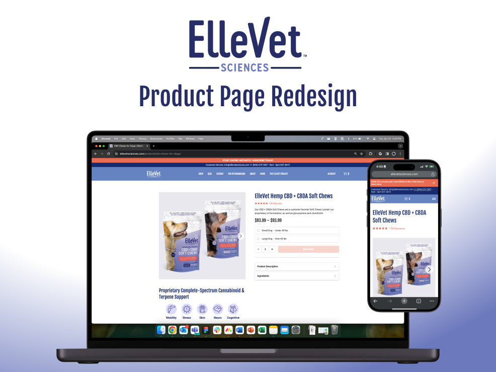
Final Product
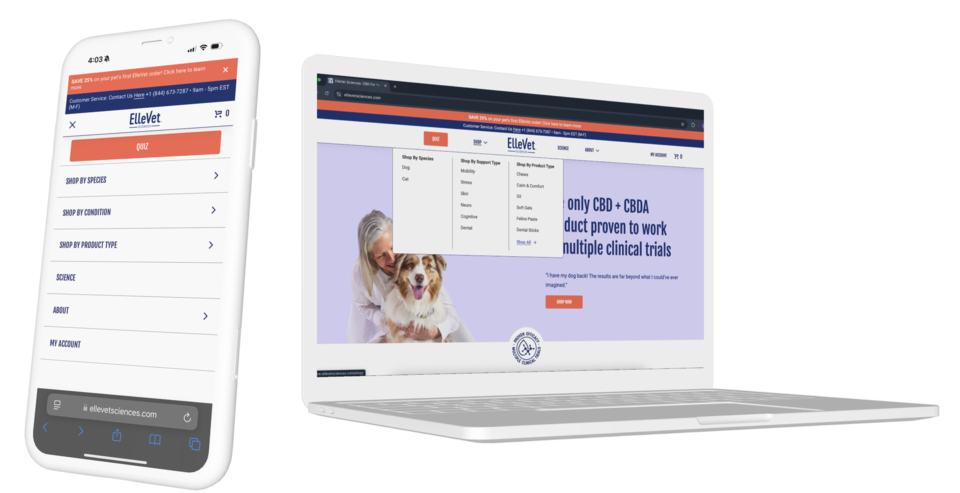
After all of the thought, design, and dev work that went into this project it feels so good for it to finally be out in the world for our customers to use. Not only will this new design make navigation easier for people now, it is designed with future company growth in mind. The recategorization of products will enable these pages to be dynamic and update without a hitch as new products are added. The availability for a "pre-filtered" shop page allows people to get right to the specific products they want. And on top of it all, we were able to give our brand image a face lift with a simple color and company logo placement change.
I have learned so much about backend product management, Information Architecture planning, new (to me) user research techniques/software, and my own design process. My role as a UI/UX Designer at ElleVet Sciences is always evolving and I feel like this was a big test of my technical product management skills. This has led to a newfound UX confidence as I have gotten these experiences under my belt!