OVERVIEW
Summary
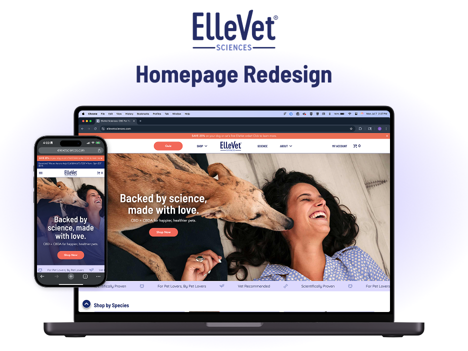
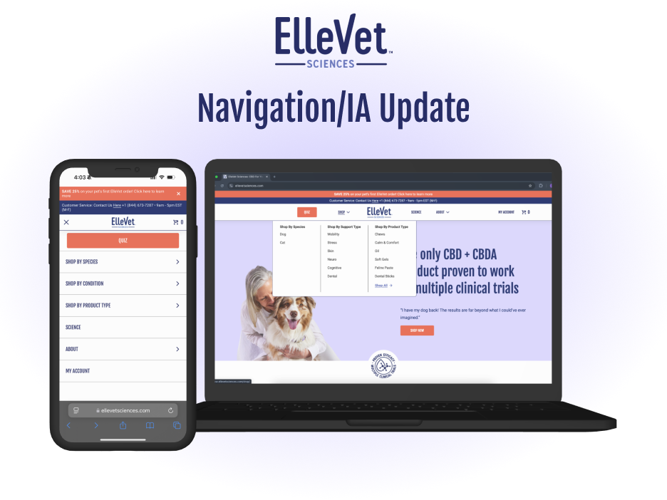
Working as the sole UI/UX Designer has come with its wins and its challenges over the past eight months. With the support of the rest of the ECommerce team, Marketing team, and Developers, we were able to design, iterate, and execute my first major update to the design of crucial product pages on all three of ElleVet Sciences' websites. It's exciting to get started on even further iterations and UX updates across other key areas of the website.
After months of site-auditing, viewing customer behavior using Hotjar, and hearing key feedback from the Customer Experience team, I was able to implement a better UX for our customers. We work with a "crawl, walk, run" mentality so some of these changes were incrementally added. It's still a pretty green project from a pretty green designer, but so far all feedback has been positive. In this case study, I will review what my design process entailed over the past eight months and how we arrived at this improved UI/UX as a team.
Role
In my role of UI/UX Designer I was responsible for any UX research and visual design/layout of the pages. I also assisted with the implementation actions on launch day.
Tools Used
Hotjar
VWO A/B Testing
Figma
Phase 1: Site Auditing/Research
From my very first day in this role, I started conducting a general site audit for how our UI was or wasn't working to create a better user experience. The screenshot above shows the state these product pages were in. It looks like a standard product page you'd see on any ecommerce website, but as I put myself into the shoes of a first time user, I quickly realized some major flaws with the UI that could lead to confusion and page abandonment.
1. The buttons for the size options act like radio buttons, but don't look like a radio button.
2. Users need to scroll below the fold before they see the Add to Cart button.
3. The picture thumbnails are small and holds little motivational value to click other pictures
While those three points are more centered around specific component flaws, I also felt like there was some wasted real estate on the page. The strange bullet-point formatting and large blocks of text and white space don't really get customers excited to add these products to their cart and convert to a sale. There were plenty of opportunities to utilize this space better, but I needed more proof to go to the team with to back me up.
Hotjar to the rescue!
Unfortunately, for the first few months our Hotjar heatmaps were not working, so the only functionality I was able to effectively use were the recordings. After watching many different user sessions I had a backlog of highlights that I could show to the team. I set up a bi-weekly Hotjar Watch Party where I could show and explain where users were running into issues using our website. Now people across multiple departments could see the UX from the Customer's perspectives and understand where I was coming from when I would suggest changes down the road.
Luckily, the heatmap issue got resolved later on! Later in this case study I will show a side-by-side comparison showing how the improved UI has led to an increased user scroll depth and a more focused and easily navigable product page experience.
Getting started with A/B Testing
The observational nature of Hotjar recordings is good for gaining insights, but does not provide a lot of objective data to base decisions off of. With all of these ideas for what the website could start shaping up to be, the next logical step for me was to perform some AB tests on redesigned product pages.
I had never conducted true A/B testing or used an A/B testing software before, so there was a learning curve for what makes for an effective test. To be honest, I'm still learning this important UX research skill. With only two developers on the team, their time is a coveted resource, so I had to create these test variations with the no-code visual editor available through the VWO A/B testing software.
The test: Product Page Redesign
Variations:
A) Control
B) Text description shortened
C) Moved Add To Cart button up to top of page
D) Combination of B and C
Metrics: Purchase conversion
Length: 2 weeks/1800 users
VWO runs a statistical analysis on the conversion rates of each variation to provide a "probability to be best". In this case, the control ended up being the winner but not with any resounding authority. The combination of B and C had a probability of 13% to be the best. That may sound small, but this was truly only a difference of 15 conversions, and due to some test-entry discrepancies there was actually a higher percentage of conversions for the combination variation. Admittedly, my hypothesis is this test should have been run for a longer period of time or repeated with only the control and the combination variant. In this fast-moving environment of a small ECommerce company though, we needed to run with what little data we had. I was thinking about what might be missing from this combination variant and with some psychological extrapolation I came to this conclusion: If I'm going to shorten the description I need to enable the user to seek more information on their own above the fold.
Phase 2: Planning/Visualization
It was now time to start putting pen to paper and vectors to Figma. The main changes I knew I wanted to make from the start were to address the issues I saw from my initial site audit:
- Make the radio buttons look like radio buttons
- Move the Add To Cart button above the fold
- Fill some of the white space to excite and educate customers
- Improve the picture carousel interaction and UI
The other important thing I wanted to address was how to add or move some of the lengthier information snippets without cluttering the page. A more fleshed out FAQ section, or accordions with product description and ingredients was my first instinct.
Improvements made in the final design:
1. Radio buttons with hover and action states
2. Shortened initial description
3. New whimsical but meaningful icon set from the creative team to display the types of ailments our products support
4. Collapsible accordions for more information only if wanted from the customer
5. Information cards just below the fold
6. Improved FAQ section
7. Easy access to the Administration (read: Dosing) Guide through a button rather than through the picture carousel
8. Removed thumbnails and added arrows to make picture carousel more enticing
Phase 3: Implementation
This is the phase where all the work comes together between all teams involved. My work as a UI/UX designer throughout this whole process has been to not only make the new design, but more importantly explain why and how the changes to the design will improve the overall site UX. Marketing/creative has crafted new icons, written new copy for the added information sections, and expressed their thoughts on layout and content from the perspective of how it will effect SEO. The developers have been editing the front end theme and backend framework to allow for an easy transition between the old and new designs.
Finally, the time had come to make these page updates live for everyone to see. Our months of research, designing, and strategy-building finally came together on launch day to go off without a hitch. Now, all there was left to do was wait and see how real-life customers would react to the new design!
Final Phase: See the Results
In the Research phase I mentioned how our Hotjar heatmaps weren't working the way we wanted them to at the beginning of this whole process. Well soon after this new product page UI got implemented they started working, and luckily it worked retrospectively. Below, you can see a comparison of scroll depth that indicates people are more curious about what is on the page. Before the change, the gradient is tight and indicates a lack of interest in what is below the fold. Now, with an expandable information accordion and the FAQs immediately available below the fold people can get their questions answered without straying too far. I think this indicates a healthier user experience. Instead of being heavy with information above the fold, we now let people either purchase quicker or discover more information on their own.
Old PDP Scroll Depth Heatmap
Updated PDP Scroll Depth Heatmap
We only have a couple months of GA4 data since the implementation, but from what we have seen so far, the add to cart rate and the "begin checkout" rate have both increased. For the month before implementation, add to cart events were at 5,138, while the two months after implementation were 6,097 and 5,616. There is a proportional increase of users beginning checkout as well.
Since the ultimate goal of an ecommerce company is to increase conversions, this apparent success from my first major UI/UX project has been very encouraging. Encouraging from my standpoint, but also from my team's perspective on my authority as a Designer. Being able to share these successes with the team has everyone excited to see what other UI UX improvements I have up my sleeve. And I'm excited to continually make the website better and try new things along the way!
